[EN] Role UI Designer / Product Track CXM / Timeline 2022 / Project Design System
To comply with non-disclosure agreements, some sensitive details in this case study have been intentionally generalized or omitted.
To comply with non-disclosure agreements, some sensitive details in this case study have been intentionally generalized or omitted.
Overview
This project focused on building a scalable design system that eliminates redundancy and accelerates design-to-dev handoff. The principles below reflect solutions adopted by industry leaders in design systems
This project focused on building a scalable design system that eliminates redundancy and accelerates design-to-dev handoff. The principles below reflect solutions adopted by industry leaders in design systems
About
Track.Co's Design System - A performance-driven design system for Track CXM.
Track CXM is a customer experience management platform developed by Track.Co. It helps companies monitor, analyze, and improve customer interactions by collecting real-time feedback and turning it into actionable insights.
Track.Co's Design System - A performance-driven design system for Track CXM.
Track CXM is a customer experience management platform developed by Track.Co. It helps companies monitor, analyze, and improve customer interactions by collecting real-time feedback and turning it into actionable insights.
Challenge
As the team grew, it became essential to define a clear workflow for the UI team — standardizing Figma files, organizing how they should be handled, and documenting what was done and how it was done in each request or prototype.
To ensure more consistency across the team's work, we needed a complete mapping of Track.co's Design System, which includes around 36 components and several untracked instances.
At a more advanced stage, it was also necessary to define a standardized handoff process for delivering designs to the tech/front-end team.
❌ Confusing files that didn't match what was happening in Jira boards.
❌ Covers were rarely used and when used, didn't reflect the Project's reality.
❌ File pages dedicated to each request/prototype.
❌ Design System split across multiple files.
❌ Covers were rarely used and when used, didn't reflect the Project's reality.
❌ File pages dedicated to each request/prototype.
❌ Design System split across multiple files.
✅ Organized projects with cards in Jira.
✅ Standardized covers containing maximum relevant information about requests.
✅ Pages with versioning: Studies/Screens/Prototype/Handoff/History.
✅ Unification of Design System files and addition of new standards.
✅ Standardized covers containing maximum relevant information about requests.
✅ Pages with versioning: Studies/Screens/Prototype/Handoff/History.
✅ Unification of Design System files and addition of new standards.
UI Audit: Figma, Storybook, and Production
With file structure and standards in place, the next step was to identify as many UI inconsistencies as possible across the Figma–Storybook–Production triad.
Among several findings and mismatches, these were the key insights revealed during the audit:
- Standardization of files in Figma.
- Need for quality checklist, documentation standardization, and handoff.
- Out of 37 components: 4 Documented, 50% in Storybook and Production.
Action Plan
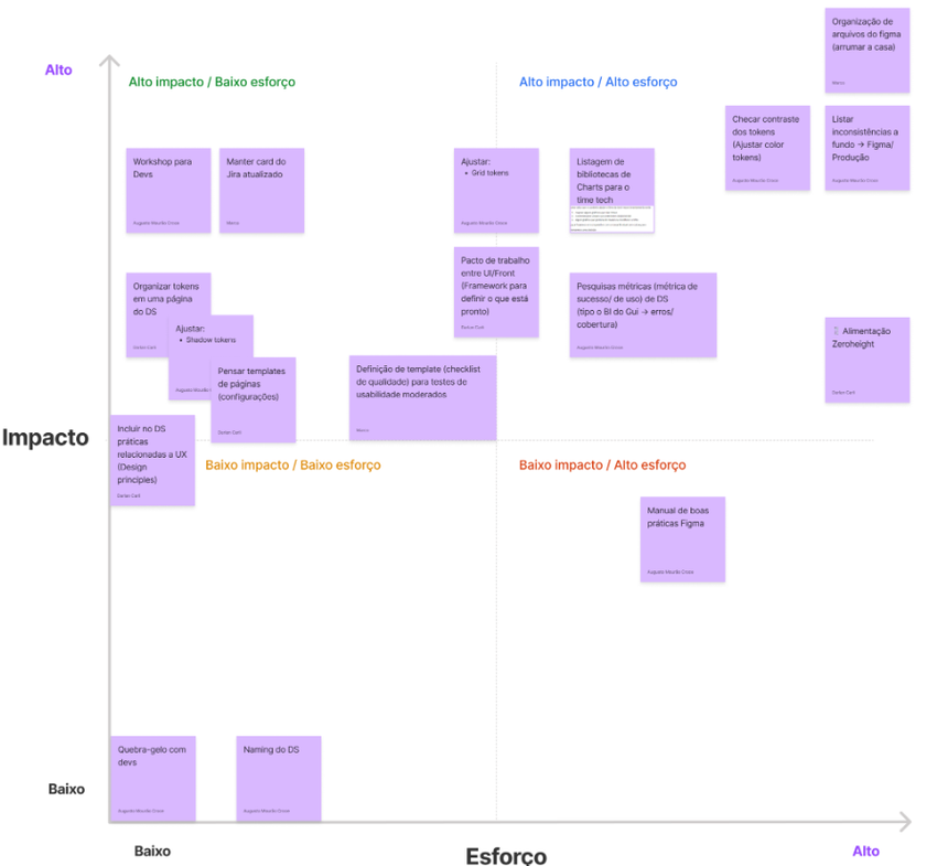
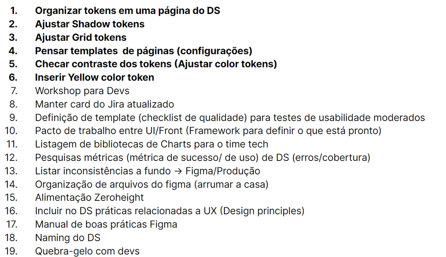
To define which initiatives to prioritize, we created an Effort vs. Impact matrix that guided the entire process. This resulted in around 20 key actions, including:
- Reviewing, adjusting, and creating new design tokens
- Defining templates for documentation and handoff
- Establishing component Do’s and Don’ts
- Setting success metrics for the design system
- Strengthening alignment with the front-end team through definitions of “done,” workshops, and team-building sessions
Component Mapping
All components required a thorough review, so we defined three stages to consider a component as fully reviewed: Complete handoff, Fixes (if needed), and Documentation on Zeroheight.
To ensure visibility across the entire Product and Tech teams, we created a detailed spreadsheet showing the status of each component. From a total of 36 main components and 189 instances:
- 100% of components reviewed in Figma.
- 100% with complete handoff ready.
- 73% of components needed fixes, 96% with fixes completed.
- 70% in production.
- 50% in Storybook (Well-implemented handoff speeds up the tech team's process).
- 20% in Zeroheight (Initial process).
Token Review
During the Design System token review, we uncovered inconsistencies that could significantly affect the workflow — both in prototyping and in the handoff process.
To address these issues, we implemented several improvements:
- Created new spacing tokens to fill gaps in the layout grid
- Introduced handoff-specific tokens that greatly reduced production time
- Restructured typographic tokens, which were previously based on the 8px grid but lacked a clear hierarchy
- Conducted a study to introduce missing colors that were needed for specific use cases
- Researched and proposed a more accessible color palette
Handoff
To ensure a more accurate and efficient handoff from the UI team to development, we held discussions with the front-end team to better understand how they interacted with Figma.
Key findings:
- The "Inspect"/"Dev Mode" tab in Figma was rarely or never used
- Interactive prototypes were time-consuming to navigate — understanding screen flow was more valuable to the devs
Based on these insights and benchmarks from other handoff processes, we defined a handoff template that includes:
- Component anatomy
- Spacing guidelines
- Typography specifications
Iterations
The iterations with the front-end team were highly constructive, progressively reinforcing the adoption of fully documented and handed-off components.
The iterations with the front-end team were highly constructive, progressively reinforcing the adoption of fully documented and handed-off components.
Production Time
The improved handoff process significantly reduced production time across the pipeline:
- Design prototyping became faster, thanks to fully finalized components
- Front-end development also accelerated — delivery times improved, and developers had fewer questions about the design decisions
- PMs and POs who followed the process after the components were fully aligned reported a noticeable improvement in the delivery quality of both design and front-end teams
